Sometimes you need a new perspective. We have created exactly that for bildmühle: With a strategic brand sharpening and a rebranding that emphasizes its creativity and professionalism, the brand now appears clearer and more self-confident – while remaining 100% itself.
A rebranding is much more than just a new logo. For bildmühle, it meant rethinking the brand from the ground up: four personalities, one common core. In an intensive analysis phase, we clearly identified the essence of bildmühle and translated it into a concise corporate identity. The corporate design also builds on this. The new appearance creates clarity and structure. At the same time, there is enough room for what makes bildmühle special: creative freedom, strong accents and an eye for the extraordinary.
client: bildmühle
concept, strategy & branding: Studio Praam
photography: Kevin Mohr & Studio Praam

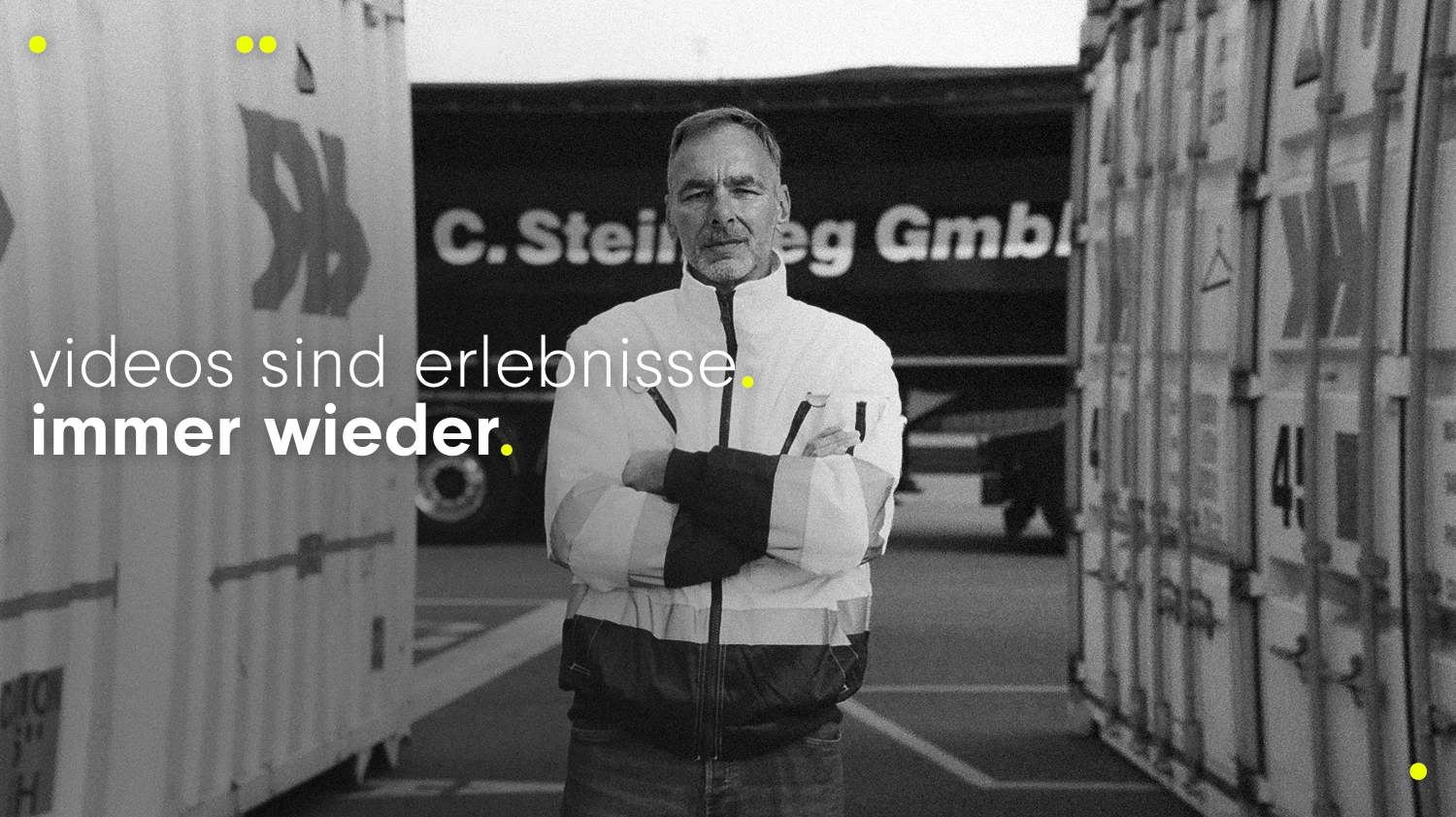
bildmühle impressively stages culturally relevant stories. As a full-service film production company, bildmühle specializes in creating films and commercials that are not only seen, but experienced.
Our drive is to produce content that touches, moves and has a lasting effect – visual experiences that resonate for a long time.
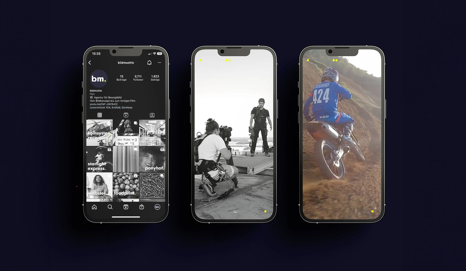
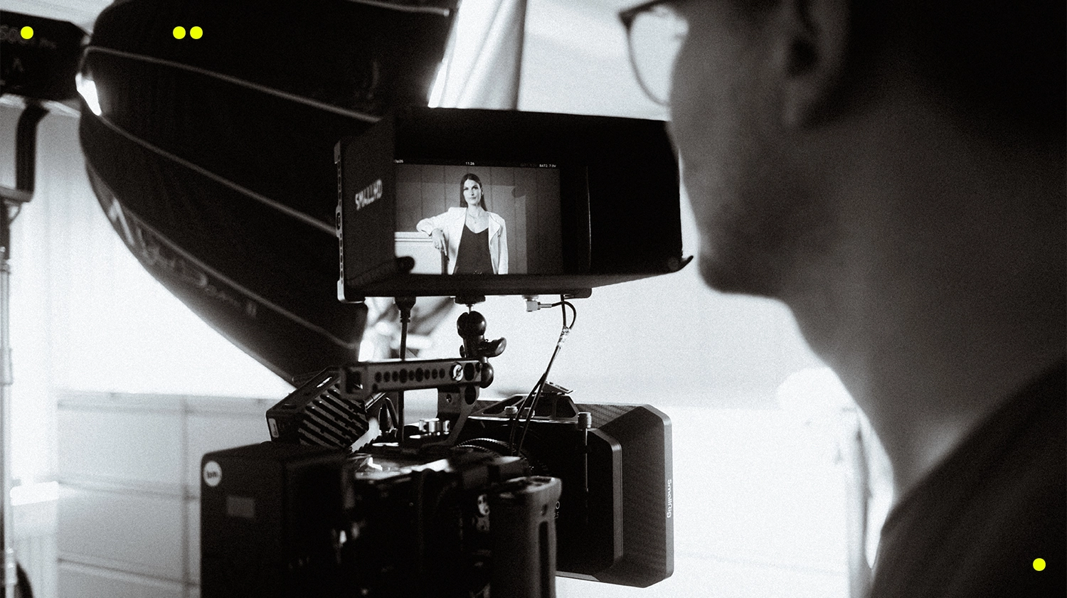
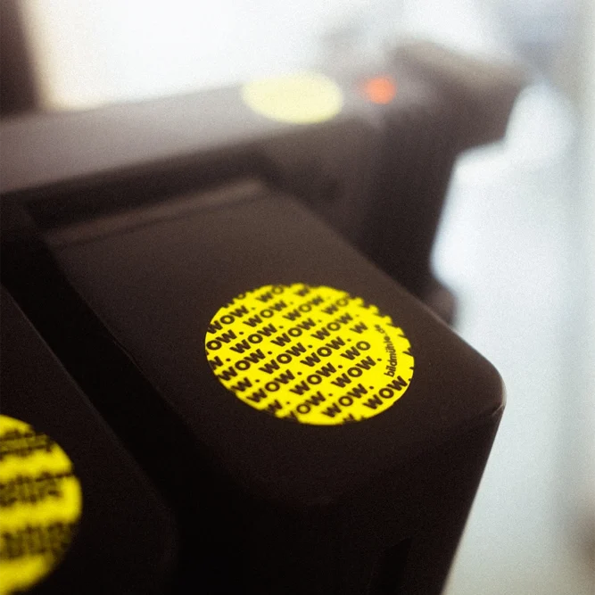
A logo that is part of something bigger: the four yellow dots not only stand for the founders, but also for a well thought-out design system. These dots are a central element that can be found consistently throughout the entire brand presentation.
The intense color scheme, combined with timeless and versatile typography, creates an appearance that solves many challenges simultaneously. It is flexible and structural, reduced and eye-catching. At the same time, it gives the work space and emphasizes the unique character of bildmühle.
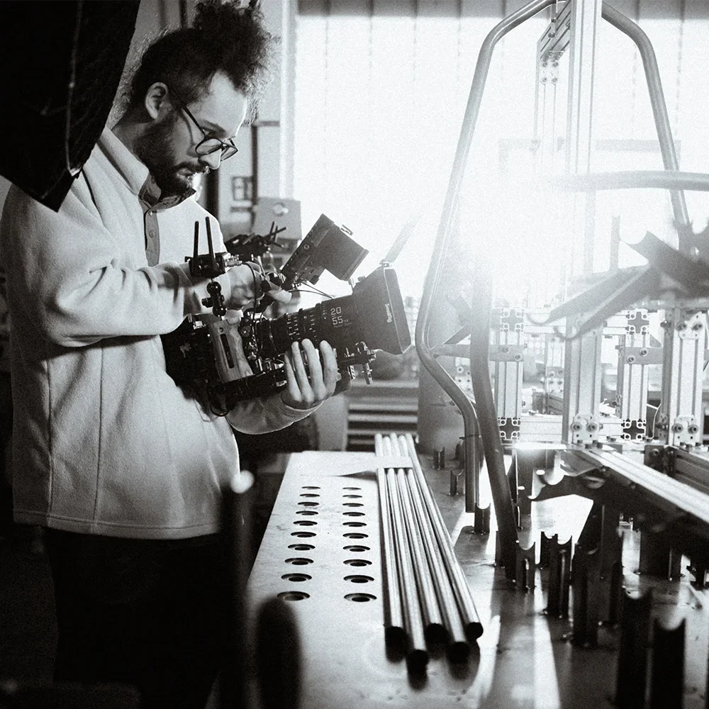
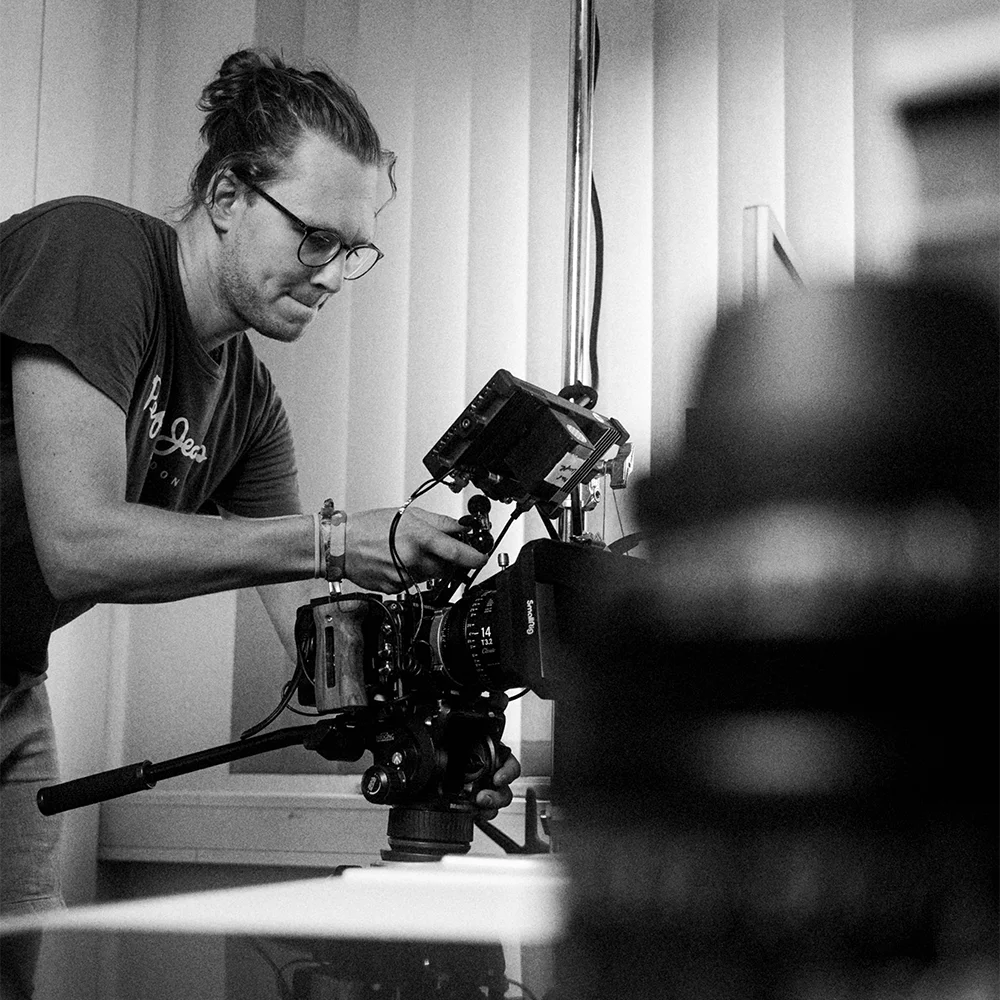
For bildmühle, it was crucial to unite the visions and perspectives of the founders. And strong branding that creates identification begins within the brand. In an intensive analysis phase, we worked together to identify the core of the brand – the essence that makes bildmühle unique.
On this basis, a corporate identity was created that makes its values and goals visible and forms a strong foundation for the rebranding. Step by step, an idea became a real brand and a visual identity that inspires and connects in equal measure.


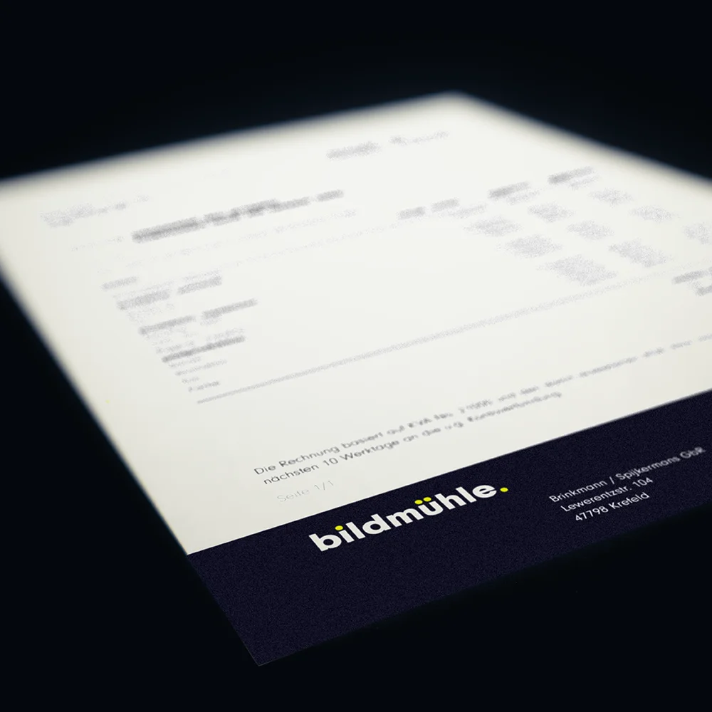
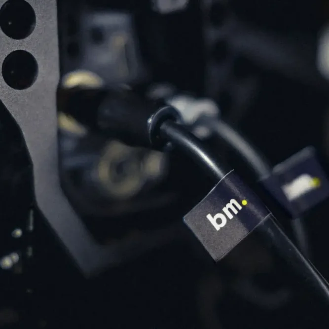
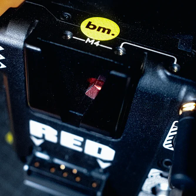
Our corporate design for bildmühle is more than just a creative foundation – it is the stage on which the brand unfolds. Like a movie, it makes aesthetics tangible: it provides structure, sets concise accents and creates space for creativity. Whether in everyday analog or digital presentation, the design supports every scene of the brand – subtly in the background or powerfully in focus. In this way, every interaction becomes part of the staging that makes bildmühle a tangible entity.

Studio Praam
van Amstel & Prangen GbR
