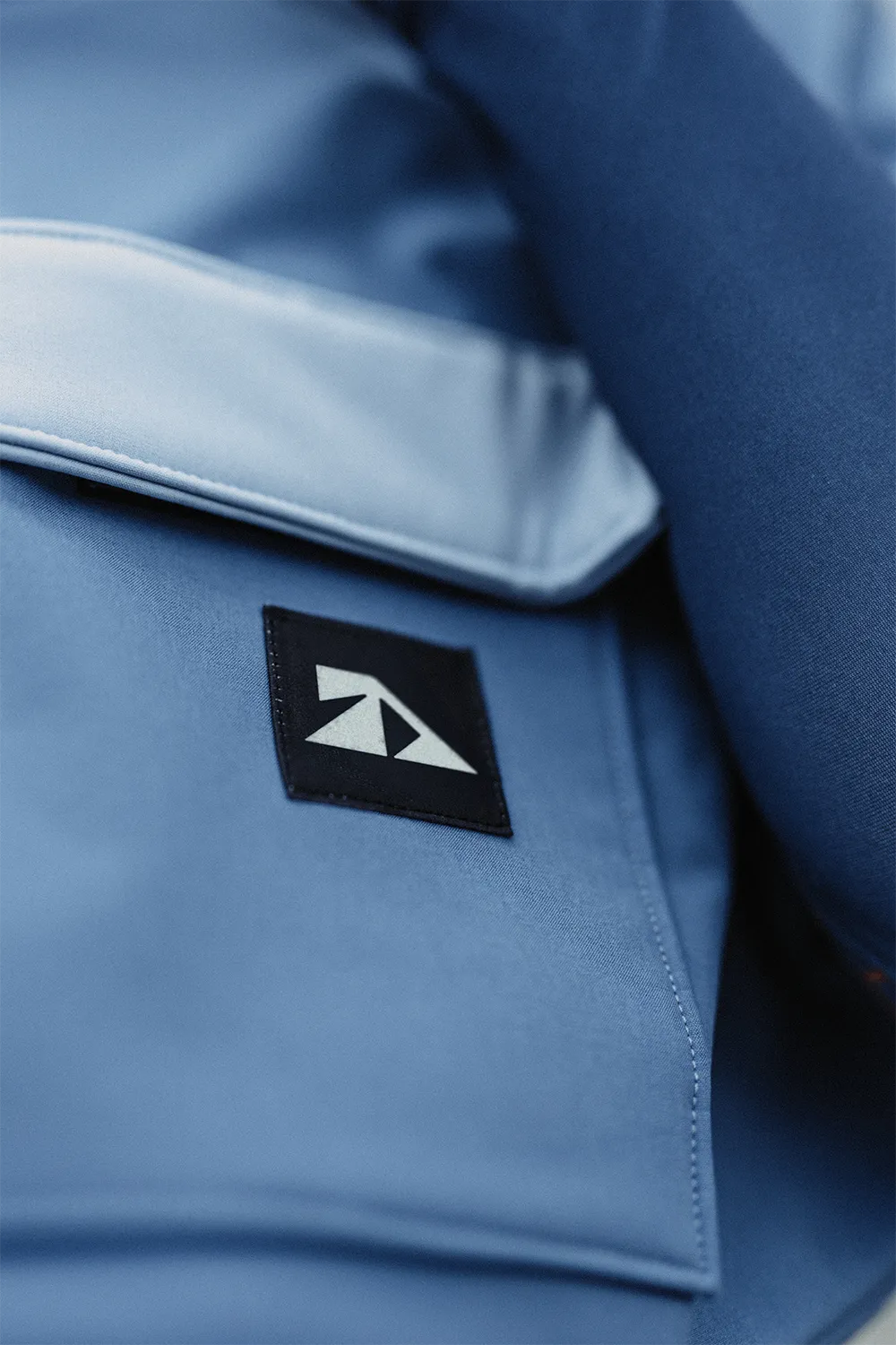
Antonia Dannenberg designs fashion that is wearable and expressive at once. Her work combines aesthetics, technical precision and a clear point of view into a visual statement. For the award-winning designer, we created a personal branding that gives this attitude visibility and leaves space for evolution.
Client: Antonia Dannenberg
Photo & Video: Kevin Mohr
Producing: Studio Praam
Corporate Design: Studio Praam

Antonia moves between design, engineering and social awareness. Her creations bring together function and emotion, depth and wearability. Through an in-depth analysis, we didn’t aim to dissolve these contrasts, but translated them into a clear visual system.
The result is a wordmark and icon that unites technical structure and organic growth. The symbol plays with geometric clarity and the idea of elevation and perspective. Its triangular structure is based on 45-degree angles, evoking both architectural and natural forms. It does not explain itself, but unfolds over time – from the designer’s core, outward.
We already got to know Antonia and her way of working during our visual production of her collections Meltdown and tides. That understanding became the foundation for the next step: a branding that doesn’t just represent her but strengthens her presence. It also reveals how much the outdoor and sports world shapes her creative approach.
What started as a collaboration turned into trust. What was once an idea became a brand. And from a name, a presence emerged that brings together what defines Antonia Dannenberg: depth, clarity and conviction.
Studio Praam
van Amstel & Prangen GbR
